|
|
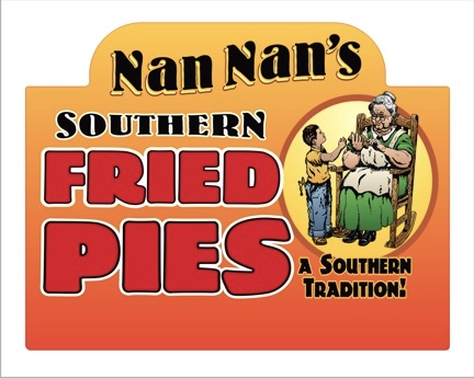
| Original artwork for the logo was created in our usual manner, starting with a pencil sketch and refining the detail, it was then inked over with fine point sharpies to add more shading and finer details. The boy and granny were two separate drawings and combined after scanning into the computer. The image was cleaned up and fine tuned a bit more in Corel PhotoPaint before auto tracing and bringing into Corel Draw for coloring. Blends and fountain fills were used to fill the white objects from the trace program and further editing of elements finalized the logo. |
|
|
 |
|
Nan Nan's box header is a digital print on matte vinyl and measures
5.125" x 6.625". The company name and "southern" is Bernhard Bold
Condensed with envelope effects for distortion. FRIED PIES is a hand
drawn typestyle and "a southern tradition" is a font named
Dinosauria. This was a fun project that let the creative horses run,
in a time when most customers are looking for just a plain and
simple job, it is good to get a client that needs this type work to
help promote their product. If you are around Middle and West Tennessee and see this product in a store, you should try one of their pies, it's the closest thing you'll find to "one like Grandma used to make". |